Spaces 4 Living

An Architect's Idea Book: Sharing ideas and inspiration to help create beautiful living spaces.


Leave a comment

Kitchen Design – The Basics

Before you start picking cabinet styles and colours there are a few basics that need to be addressed.

A kitchen layout

There are two design philosophies: The work triangle and work zones.

When kitchens were smaller, compact and a few dozen less small appliances, the work triangle made the space more ergonomic. With everything with a comfortable reach. The kitchen work triangle is an imaginary line drawn between three most used points in a kitchen which are the refrigerator, cooker/stove and the sink without any obstructions (i.e. table or an island). The ideal distance between points should not exceed 9′-0″.

As kitchens and appliances become larger, tasks are usually grouped or zoned. Cooking, washing and storage are the most used but it could expand to include  prep, baking, and entertaining to suit your lifestyle. When planning your kitchen, think about how you will use it. For an example, you would want to avoid walking with a boiling pot of water  across the kitchen to drain your pasta at the sink. So you place the sink close to the cooker or you could add an additional prep sink if your kitchen is large enough.

But as with most things, striking a healthy balance between both the work triangle and the work zones that suits your needs is the best solution

Standard Kitchen Layouts

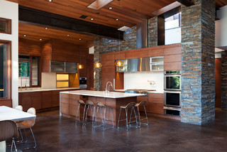
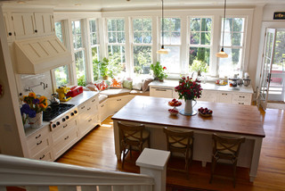
Standard Kitchen Layouts with Kitchen work triangles


Shape

There are many layouts for a kitchen: Single line (with or without an island),  Galley, L-shaped, U-shaped are among the popular configurations. Fundamentally, your layout is influenced by the size and shape of your room as well as the functions that you which to incorporate.


Balham kitchen extension
Single Line Kitchen


Decatur Bungalow New Galley Kitchen
Galley Kitchen


Kitchen 2
L- Shaped Kitchen


London Townhouse
U-Shaped Kitchen


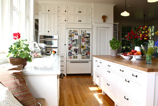
Size (or over size) of appliances and Balance

Group larger appliances to allow for a free flowing counter space. Having larger appliances dotted around the kitchen can create smaller and sometimes unusable spaces.


Add-ons and separate areas

The kitchen is also influenced by its support spaces and adjacent spaces. Thinking how they interact and potentially “free-up” some area within your new kitchen. Placing over-flow storage elsewhere in a separate pantry or adding niche spaces for bar seating.

  • island
  • peninsula
  • work/office space
  • wet/dry bar, storage
  • eat-in kitchen
  • utility room
  • pantry
  • butlers pantry
  • outside access to garden/patio
  • access to dining
  • sight lines to living spaces


Sag Harbor, NY Residence


Planning for your small appliances

One may say that “it will be fine…it’ll sort itself out” but keeping note of what you use most and when you use it, could make the morning rush a little less stressful. Grouping the coffee maker and toaster away from where you are prepping lunch boxes could relieve kitchen congestion.

Allow adequate space and height for the things you use most. If you make smoothies every day perhaps allow it to have a permanent spot. Whereas storing that stand mixer in a pantry for the occasional use will free up some counter space for your everyday activities.


Union Square Loft, New York


Conclusion

With the basics covered, you should start to know what layout and shape suits your needs and the existing space. Figuring out your work triangle and zones informs you where you should place your appliances. The sight lines to other rooms and adjoining utilities refine your choices. Where your appliances are should dictate where you store things ( pots, pans, spices, dish towels etc). Knowing what small appliances you use on a regular basis enables you to create activity spots to enhance the flow of the kitchen ( ie cereal dispenser or  coffee bar)

Now you are well on your way to pick colours and cabinets.  Have fun!


Leave a comment

Taking on “Tiny House” ideas for your own home.

The concept of Tiny House Living is becoming more and more popular. The increasing number of foreclosures and unemployment in recent years has really pushed homeowners to rethink the concept of home and its size. Most tiny homes are under 500 square feet and many have stretched this notion to 150-300 square feet house on wheels. The ideals are simple living…focusing on outdoor spaces, de-cluttering and down-sizing. Smaller housing is not just for the retirees, but for those who wish to own their home who normally couldn’t afford a house or those who feel mobility fits their life style.


Tiny houses do not imply to live without comfort, just using your space more wisely. That is a concept that we can all employ.


Vertical Space

 
Craftsman Basement by Seattle Architects & Building Designers Board and Vellum
Eclectic Bedroom by Somerville General Contractors Morse Constructions Inc.


Built-in floor to ceiling storage or creating a partition wall with cupboard and drawers lets you packs away all your collectibles.

 
Eclectic Kitchen
Traditional Kitchen by Huntington Kitchen & Bath Designers Susan Serra


Using the vertical storage in the kitchen adds a bit more visual interest as well creating more storage. Whether choosing to incorporate shelves and/or rails to display your kitchenware or you could suspend over an island   if you have the space. The wall solution is not just limited to pots and utensils, there are baskets you could add for spices, plants and even task boards.


Shallow shelving 

  
Contemporary Kitchen by Jackson Interior Designers & Decorators dwelling
Eclectic Bathroom
Finding extra space to store things in shallow shelves or thin concealed drawers that might be otherwise wasted.


Under the stairs

loft-staircase-storage  office-under-staircase
http://www.tinyhousetalk.com


Using the dead space under the stairs is a great area for added storage, closet, home office or a powder room that can fit a number of storage needs and stair configurations.

Wall niche

  
Traditional Entry by Los Angeles Interior Designers & Decorators Alexandra Rae Design
Modern Staircase by London Photographers David Churchill – Architectural Photographer
   
Modern Bathroom by San Francisco Architects & Building Designers Michael Tauber Architecture
Traditional Home Theater by Peoria Design-Build Firms Dan Waibel Designer Builder


Creating a wall niche is not just reserved for the medicine cabinet.  Framing out the space to add niches for art, books, shower shelving,  or even to hide AV equipment.

Hidden storage under bulky furniture

 14791

BoConcept  (Chiva functional coffee table & Adria Nesting tables)

We’ve seen the storage in an ottomans and drawers in coffee tables, but the Chiva coffee table combines both ideas with elegance. Nesting tables are not a new concept, but them are coming back into trend. Storing tables beneath tables is a traditional and simple space saving innovation to keep.


Hidden bed


Poppi Theatre by Resource Furniture
 
Atoll 000 by Resource Furniture


Nothing short of amazing! I love the ideas that Resource Furniture has to offer. A twist on a murphy bed shown here is only a small sample of what they create. These beds are a vast improvement from the traditional hide-a-beds for guests in the living room. So comfy, they could be your own bed.


Dual Function and Transforming Furniture

Goliath Glass Table 
Goliath Glass by Resource Furniture

Modern console table transforms into a dining table suitable for 8 people. Incredible!


Loft Floor Space

Tiny House Floor Storagehttp://www.livingbiginatinyhouse.com

This storage solution is not for everyone, but for the loft or attic floor especially in a mobile tiny home, this is a great idea to incorporate storage without incrouching floor space with large furniture.


core77.com

If you can’t go over, go under! (the floor). Using the ceiling space between floor joists is a great spot to keep your books and trinkets.


Knee wall storage

 Traditional Hall by Chappaqua Architects & Building Designers Fivecat Studio | Architecture
Contemporary Family Room by San Francisco Interior Designers & Decorators Ashley Roi Jenkins Design, LLC


Built-in storage into the knee wall maybe a great solution for hard to find furniture pieces and it keeps the floor space open.


There is always a storage solution, no matter the size of the space. Whether choosing built-in, dual function, transforming, wall space, floor space are but a few examples to use space more wisely and many more ideas out are there.


2 Comments

The Art of Decorating with Black


So often many fall at the wayside away from colour and slump into the unfulfilled wasteland of beige! Some are intimidated to commit to using bold and bright colours in there living spaces…so goodness knows how they would react to black. OK black is not actually a colour, but it is a bold choice.

There are ways to enrich your space, just remember a little does go a long way.


Black Doors


Black doors can help create an upscaled and elegant look,  not just for the exteriors but the interior doors as well. The vertical plane of black draws your eyes to the other black objects in the room and creates a visual balance. It also helps balance the other large black elements in the home, for example that huge 60″ television that you always dreamed of, a black leather sofa or the unlit fireplace.


Black Windows


The odd thing about black or dark window woodwork is that you look past them to the outdoors. Whereas with white, your eyes tend to fix on the white frames instead of looking beyond. Bring the outdoors inside with black, charcoal or a dark stain.


Black ceilings


Now I bet you think I have gone too far!  A black ceiling adds a completely different character as compared to the traditional white. Your eye has a tendency to look for defined details to inform it of boarders and boundaries. Therefore, if you had black or partially black walls with a black ceiling your eyes would be tricked by the size of the space…making the room feel more spacious.

On the other hand, if you were to have lighter walls and a dark ceiling, the ceiling would appear lower. This could be beneficial in a room with a high ceiling that you wanted to make it feel more cozy and intimate.


Black Floors


Black floor have a huge impact. It is a bit more of a finacial commitment than paint, but the rewards could be outstanding. It says luxury all over it. If you have a dog that sheds it maybe more of a chore to keep spotless and high shine floors show more dust so unless you enjoy sweeping every day opt for a matte or textured finish.


Black Cabinetry or Surfaces


There is one way to get your white surfaces to pop in your kitchen and that is to have black cabinets. For a  contemporary open layout this would be stunning. The black gives the modern white space living a new twist. However if you inverse the palette with white cabinets and black surfaces the same pop occurs, but with a more traditional appeal. Granted, the main influence on the contemporary vs transitional vs traditional depends upon cabinetry style and layout.


Architectural details


Why not paint the wainscoting black (charcoal is illustrated in the photograph) or the ornate frames. It gives the woodwork a new lease on life and celebrates its artistry and craftsmanship.

The key element in using black, is that it enhances the other colours in the spaces as well (in my opinion) gives a sense of solid, grounding elegance. Dare I say, its the equivalent of that “little black dress”- a staple that imbues a air of simple sophistication.


Leave a comment

1920’s Kitchen

I have been jostling back and forth the idea of renovating my kitchen. Our 1924 house still has a lot of character left, which is why I fell in love with it. The house has been through a few hodge podge  renovations mainly in the 1950’s. Some of it is good and some bad. The kitchen looks tired but for the exception of lacking a few modern conveniences, it functions quite well.  My initial thought was to revamp the whole kitchen…work from a clean slate. But the more I live here, the more I like its old charm. This house would not suit an uber-modern kitchen. Not impossible, but just a preference.

They just don’t make them like they used to. You’d be hard pressed to achieve the details of the era without a skilled carpenter. Most kitchens in the 1920’s and 1930’s were built on site, hence the reason why many of the cabinetry components are not sized exactly the same. But then that is the beauty of it.

The hallmark white found in kitchens and bathrooms of the time is a reflection of society emerging understanding of germs and the resultant sanitary craze. Albeit, they thought you could “see” germs more effectively on a white surfaces.

I want to show a few examples of some wonderful vintage kitchens circa 1920-1930. Some of them have been remodelled, some original and others are new to look old.


The image above is a fine example of reworking with what you have and promoting its beauty. The gorgeous inset cabinet doors are a design highlight of the craftsmanship of the age as well as the pulls and lock style.  The vintage O’Keefe & Merritt Stove (circa 1940?) is a great centrepiece complete with custom hood that covers a standard extractor hood fan with a drywall/ plasterboard box and added trim. The marble counter top ties this kitchen into the present as well as hiding the quintessential piece of our era…the dishwasher!


This 1920’s bungalow has a lovely remodelled galley kitchen. The expansive craftsman style windows are what makes this room sing. Although the cabinets are modern, the layout and open shelves are sympathetic to the architectural style.


This kitchen had a low ceiling which the architect opened up to create a much loftier space with A vaulted ceiling and exposed decorative beam and collar ties. The vintage stove is a great centrepiece once again, but not to worry, the charm would still be achievable with a modern cooker or range. A contemporary Aga would look amazing without detracting the overall style of the room. The slim 2×6 tile in a herringbone layout and gives a wonderful texture to the backsplash and still adheres to the white on white palette of the era. The tiles appear to be more artisan and slightly irregular than the typical mass-produced subway tile. Which in itself is a statement of the arts and craft (craftsman) philosophy. The island adds another layer of character to the kitchen. It lends itself to be a separate piece of furniture and replicates the limestone of the floor.


This kitchen is surprisingly within a 200 sqft new addition. This is a bit too “vintage” for my own taste, but you have to commend the designers integrity. It is complete with bead board wood panel walls, pull-out integrated cutting boards  and scalloped woodwork at the sink doors. Even the accessories look vintage.

There are no hard and fast rules of how far you should restore your interior (unless it is a listed historical interior). Restoring does not mean that you have to do without the mod cons, if you look each kitchen above has an integrated dishwasher, so why not a wine fridge?  Anything is possible, it is only a matter of how far you wish to push the envelope.  Enjoy exploring the options.


Entertainment Products & Party Supplies
    Breast Cancer Awareness


Leave a comment

Sunny Conservatory


Conservatory…Sun lounge…inside-outside room…Sun room, whatever you like to call it they are almost one in the same.  All are enclosed in windows, although a conservatory has the addition of a glazed roof. Not too dissimilar to a greenhouse attached to your house, but far more detail orientated.


Traditionally, a conservatory was used to house citrus fruits and tropical plants brought back to Britain from merchant traders during in the Victorian and Georgian eras. The delicate plants of India, Africa and the Far East needed shelter from the more northern climates. Nowadays, the conservatory is used as an additional room in the house.  Integrated into the whole functionality of the house a conservatory can bring the wow factor into your home.


Often used as an additional sitting area or lounges, the amount of glazing brings you closer to nature but leaving the elements at bay.


This gorgeous example of a conservatory brings an homage to the traditional grandeur that the Victorian era exuded. Used as a sheltered seating area of the deck, it creates a cascade of spaces from house to shelter to deck to garden with each step unwrapping its layers.


With a flair to the modern, this home office is inspiring. The gentle curve of the glass softens the space. The sloping glass has a filter to protect the residents as well as retractable blinds for additional shading. Most glass used in conservatories do have UV and protective coating options much like typical windows.


The fabulous monochrome kitchen takes a step back as it lets the back garden/courtyard play at the window. The sleek simplicity from head to toe just draws you in.


    Contemporary Annabelle Modern Yellow Linen 32-Inch-H Mid-Century Chair    Woven Jute Roll Up Blinds 48 Inch, Width - 48 Inches    Fiore Floral Patterned Acrylic Accent Chair


Leave a comment

Make the most out of a small kitchen

The heart of the home is the kitchen. It is not only where we create sustenance for our family but also where we talk about our day, bond as a family, do homework, create projects and have fun making a mess! Sometimes we need to make the most out of the space that we have, no matter the size limitations. It just means that we have to be a bit more savvy with what we already have and know how much we can push to get what we want for the space, as long as we are realistic.

The key objectives are to:

  • create and enhance the ERGONOMICS,
  • enhance STORAGE,
  • maximise USABLE SPACE
  • and to be open to DE-CLUTTER


This kitchen in a  19th century row house, it is small but efficient. The traditional white cabinets, contemporary stainless steel appliances, and understated ironmongery/hardware lift this kitchen. Perhaps only one cook can fit into this kitchen at a time, but everything is just at your finger tips.  This kitchen design emphasis in the de-cluttering and simplifying of the space. The cabinetry and ironmongery are uncomplicated in that they not distracting. A lovely little detail with the kitchen taps/ faucet where they are not resting on the counter and the sink is under mounted. This leaves the beautiful Pietra del Cardosa. counter to be visually uninterrupted.

The small (can I say micro?)  kitchen above appears larger due to the open concept into the dining room. The choice of all white cabinets and walls allows your eyes to casually wander. The kitchen above is a prime example of the compact ergonomics. The best layout for small kitchens is to have the cooker, fridge and sink in an equilateral triangular placement. It is about promoting the ease of movement. Although I do understand the want to keep the full height window, however the kitchen would have been better served if the lower cabinets extended to the exterior wall for extra preparation space rather than the ability to walk around. It is such small space, storage and usable space are also vital.  I do like a lot of the elements of this space, the simplicity of the pendant lights and Turner bar stools. The quartz counter and backsplash and the oak herringbone pattern flooring and  the ceiling height cabinetry add a feel of luxury. It enhances the space with a sense of bespoke/ custom detailing.

Space is precious in this small two storey. The limited footprint just fits the dining, living, kitchen, and powder room on the same floor. The high gloss smoky grey cabinetry gives this compact corner layout a high calibre studio feel. The shiny stainless steel appliances integrate well within the grey tones, while the choice of a fashionable white fridge tries to sink into the wall. Albeit, a custom built-in fridge with the same glossy smoky grey door would have looked stunning. The white solid surface waterfall detail has a lovely contemporary look at the edge of the counter. The look balances the white, grey, and steel tones beautifully. There is no ironmongery/ hardware to distract and break up the panels. Many cabinetry manufacturers offer a press-release system so that you can keep the design sleek and uncluttered.

All in all, there are always options for any scale of kitchen project. Just keep to one design theme and work it throughout the room. Most importantly follow as many rules as your space can allow for ergonomics, storage, usable space and de-clutter.


www.legourmetchef.com
  BurkeDecor.com has a new look!  


4 Comments

Sleek Contemporary Kitchen

This is not your mother’s kitchen! This beautiful contemporary kitchen by Ward-Young Architecture & Planning has me thinking of mountains and forest views. The lofty ceilings, the mix of stone and wood create a feeling of an alpine paradise.

The stone veneer is rustic, heavy and has a great textural presence. It is offset by the smooth faces of the sleek cabinetry. The cabinetry sinks into the overall wood décor of the open plan. By using a similar wood treatment on the ceiling, window trims and door encourages your eye to accept the kitchen as an extension of the room, not as a visually separate room.

The waterfall edge detail of the kitchen island surface boosts the contemporary nature of the space. The backsplash is also in white which enables you to experience the different materials in the space without congesting it.

The flooring picks up similar warm hues as the wood. The large grid pattern of the coloured concrete creates a uniform plane that is not subtractive of the integrity of the high quality materials used in the space.

Overall, this kitchen displays well placed, high quality finishes that amplifies the contemporary design


Leave a comment

Traditional Santa Cruz Kitchen

This house has many features and spaces that just makes it feel so welcoming. It makes you want to get comfy and unwind with a cup of coffee. Of all the wonderful spaces,  I just love this kitchen. The tall windows bring in a lot of natural light and creates a great connection to the outdoors which promotes a good sense of well being.

Along the periphery there is tall white custom cabinetry that extends up to the high ceilings. This is a great way to add more storage and to create a modern edge within the traditional style without overdoing it. The walls and cabinetry are painted “cloud white” and are visually merged together. The ceiling coving also wraps around both cabinetry and walls. Both treatments add to the uniformity, openness and airiness of the space.

A gorgeous butcher block island adds warmth, practicality and a great breakfast area. The corner window seat is inviting and relaxing.

Although I adore this kitchen, there are a few things that I am not taken with. The refrigerator and hob/ cooktop are on the opposite sides of the kitchen.  I could see as being a nuisance if you are like me and run back and forth to the refrigerator for ingredients. The sink is also far from the hob which is an issue when you are carrying a pot of steaming pasta that is ready to drain. Ideally, if one of the appliances were to be located in the island for a smaller work triangle it would be more user friendly. However, I do understand the desire to keep the island free in order to keep the visual of a farm house table work space in the centre of the room. It all depends what you would be willing to compromise: function or style.

Overall, this is a spacious yet cozy room that blends the sensibilities of a family orientated traditional kitchen but does not hold back on the desires of the modern. This is a great area that mixes home cooking, conversation and relaxation for a great well balanced space.